Introduction #
Thank you for support our work, Amaretti is an HTML/CSS/JS admin template based on the famous Bootstrap framework, made it with love in every pixel.
In this document you will find a complete guide which covers topics about the product functionality, components, structure, workflow and the initial setup.
Folder Structure #
Once you've downloaded this product, extract the zip file and you will find these directories:
amaretti
├── dist
├──── html
├──── starter
├── src
├── dep-copy.json
├── package.json
└── README.md
dist
This folder contains the final production-ready compiled files
html
This folder contains the complete distribution version with all demo content included as seen in the live preview version.
starter
This folder contains the essentials components, this version does not include any of the live preview examples. This is especially designed to get started with only the needed elements.
src
In this folder you'll find the template's source code, if you want to customize the template to fit your specific needs, this is the right place to start with.
dep-copy.json
In this file you'll find the libraries that are copied from "node_modules" to "src/assets/lib". If you want add a new libraries, this file is necessary.
package.json
This is the npm manifest file in which we define what are going to be our workflow dependencies and our main tasks.
HTML Structure #
The template main structure is divided in four sections: Top bar, Left sidebar, Right sidebar and Main content.
<!DOCTYPE html>
<html lang="en">
  <body>
    <div class="am-wrapper">
      <nav class="navbar navbar-expand fixed-top am-top-header">
        <!-- Top bar -->
      </nav>
      <div class="am-left-sidebar">
        <!-- Left sidebar -->
      </div>
      <div class="am-content">
        <!-- Main Content -->
      </div>
      <nav class="am-right-sidebar">
        <!-- Right sidebar -->
      </nav>
    </div>
  </body>
</html>
Required Dependencies #
This template require four libraries to work:
In addition to these libs, the main structure needs a basic modular js core to provide the template interaction like sidebars functionality. This file is located in "assets/js/app.js"
There are some dependencies embedded in the app.js file that adds extra functionality to the template:
- Fast Click 1.0.3
- Tiny Color 2 1.4.1
- jQuery Touch Swipe 1.6.12
- jQuery Bootstrap 4 Breakpoint Check 1.0.5
Include the dependencies #
Be sure to include the essentials scripts in your pages, for example inside your head tag should be like this:
<link rel="stylesheet" type="text/css" href="assets/lib/stroke-7/style.css">
<link rel="stylesheet" type="text/css" href="assets/lib/perfect-scrollbar/css/perfect-scrollbar.css">
<link rel="stylesheet" href="assets/css/app.css" type="text/css">
And just before the body tag ends, please add these JavaScript libs:
<script src="assets/lib/jquery/jquery.min.js" type="text/javascript"></script>
<script src="assets/lib/perfect-scrollbar/js/perfect-scrollbar.min.js" type="text/javascript"></script>
<script src="assets/lib/bootstrap/dist/js/bootstrap.bundle.min.js" type="text/javascript"></script>
<script src="assets/js/app.js" type="text/javascript"></script>

<script type="text/javascript">
  $(document).ready(function(){
    //initialize the javascript
    App.init();
  });
</script>
Top bar #
We are extending the Bootstrap Navbar component using the fixed version by default, we also added some custom elements:
<nav class="navbar navbar-expand fixed-top am-top-header">
  <div class="container-fluid">

    <!-- Navbar Header -->
    <div class="am-navbar-header">

      <!-- Brand Logo -->
      <a href="#" class="navbar-brand"></a>
    </div>

    <!-- Main topbar elements -->
    <div class="collapse navbar-collapse">
      <ul class="nav navbar-nav am-user-nav">
        <!-- User Menu -->
      </ul>

      <ul class="nav navbar-nav am-top-menu">
        <!-- Menu Options -->
      </ul>

      <ul class="nav navbar-nav am-icons-nav">
        <!-- Icons Menu -->
      </ul>
    </div>

    <!-- Right Sidebar Toggle Button -->
    <a class="am-toggle-right-sidebar">
      <span class="icon s7-menu2"></span>
    </a>
  </div>
</nav>
Navbar Header
In this element you'll find the app logo, located in the top left corner ("navbar-brand"), it will be shown on large devices and hidden on small resolutions: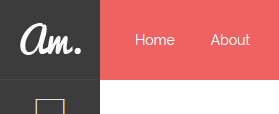
Main topbar elements
Is composed by a group of elements and most of them are going to be hidden ("am-top-menu", "am-icons-nav") on small devices.
Desktop View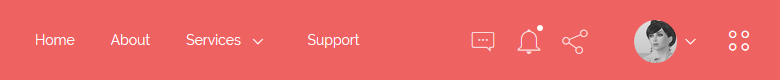
Small View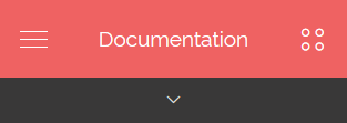
JavaScript #
In every page, we are calling an object method which handles the basic template interaction. It's written with "The Module Pattern" which encapsulates certain code, allowing to be used when it's needed.
We use a global javascript object called "App", it provides a modular structure that we use to initialize the demo Js plugins on each demo page. You can find several modules in "assets/js" inside the html folder.
Said that you'll notice that there are different Js modules for some of the demo pages, all of them are optional, exept the "app.js" or "app.min.js" in case you want to use the minified version.
init() Method #
This method is responsible for some of the bootstrap plugins initializing, both sidebars functionality and other responsive tasks. That's why this is the core method of this template.
You can add it at the end of the page like this:
<script type="text/javascript">
  $(document).ready(function(){
    App.init();
  });
</script>
Demo modules & methods #
In order to call the following methods you'll need to include the script reference of the JavaScript file, after that you can call it after the init method this way: App.methodName();
Each of these modules contain the JS init for the demo plugins, feel free to copy and modify according to your needs.
| File Name | Method | Page |
|---|---|---|
| app-dashboard.js | dashboard | index.html |
| app-dashboard2.js | dashboard2 | dashboard2.html |
| app-ui-chat.js | uiChat | ui-chat.html |
| app-ui-notifications.js | uiNotifications | ui-notifications.html |
| app-ui-nestable-lists.js | uiNestableLists | ui-nestable-lists.html |
| app-charts.js | charts | charts.html |
| app-charts-chartjs.js | ChartJs | charts-chartjs.html |
| app-charts-morris.js | chartsMorris | charts-morris.html |
| app-charts-sparkline.js | chartsSparklines | charts-sparkline.html |
| app-form-elements.js | formElements | form-elements.html |
| app-form-wizard.js | wizard | form-wizard.html |
| app-form-masks.js | masks | form-masks.html |
| app-form-wysiwyg.js | textEditors | form-wysiwyg.html |
| app-bootstrap-touchspin.js | bootstrapSpinner | form-spinner.html |
| app-mail-inbox.js | emailInbox | email-inbox.html |
| app-mail-compose.js | emailCompose | email-compose.html |
| app-tables-datatables.js | dataTables | tables-datatables.html |
| app-pages-profile.js | pageProfile | pages-profile.html |
| app-pages-calendar.js | pageCalendar | pages-calendar.html |
| app-pages-gallery.js | pageGallery | pages-gallery.html |
| app-maps-google.js | mapsGoogle | maps-google.html |
| app-maps-vector.js | mapsVector | maps-vector.html |
Create an App module #
You can extend the App modular structure easily by creating your own modules like this:
var App = (function () {

  App.moduleName = function( ){
    'use strict'

    //Js Code

  };

  return App;
})(App || {});
Getting Started #
There are three different ways to use this template in your next project:
- Basic Setup
- Using SASS files
- Using NPM scripts
Basic Setup #
This is the quickest way to setup the template, you just have to copy the "starter" folder content into your project root folder and start working on the index.html file.
Be sure to include the essentials scripts in your document to get things work properly. After that you're ready to start building.
Cons
This method is perfect if you think you are not going to make several changes to the original version and use it "as is", otherwise we suggest to use one of the following methods.
NPM scripts #
The NPM scripts are a property of the package.json file, which allows us to define commands that will be executed several times in our workflow. We can create commands to execute tasks or operations like install, compile, minify, remove, distribute, etc., all without having to depend of a task runner.
If you haven't used NPM scrips before, be sure to check out the npm-scripts documentation.
Supposing that you already are familiar with NPM scrips, we are going to explain step by step how to get started with the built-in workflow.
Install Node #
If you already have Node.js installed you can skip this step.
- Be sure to have the latest version of Node.js installed & running in your computer. We are going to use npm that comes with Node.js installation.
Install npm dependencies #
In your root folder enter the following command to install the project dependencies: npm install, this command will install all the template libraries inside the source folder: src/assets/libs, you need to run this command before you run npm run dist command in order to include dependencies in distribution.
Setup SASS development environment #
In case you don't know nothing about css pre-processors, this is a brief description about what it is:
Sass is the most mature, stable, and powerful professional grade CSS extension language in the world.
In other words with css-preprocessors you can change the full color theme of this template by just changing a few lines of code.
Setting up your css file #
- In the sass folder
src/sass/you'll find a file calledapp.scss. - Rename it to a different name, for example
app.scss=>amaretti.scss. - Then create a new file called
app.scsswhich you are going to use it to modify variables and create your custom code. -
After that, you'll need to include the original main SASS file into the new file like this:
app.scss// Your custom code goes here // Import the template source code @import "amaretti";
Inside this file you can modify the bootstrap and template variables values for example to change the color palette:
app.scss// Modify template colors $primary: #595BD4; $danger: #FD3D39; $warning: #FFCB2F; $success: #53D86A; $alt-color1: #88ca92; $alt-color2: #7fcff5; $alt-color3: #8B8CCC; $alt-color4: #cccccc; // Import the template source code @import "amaretti";
Variables #
The template comes with several veriables that you can use to customize and create your own version, alongside with the Bootstrap default variables.
To see what variables are available go to "src/sass/config/_amaretti-variables.scss".
Available Commands #
After install dependencies now you can run the automated commands that here are the available:
Custom commands
| Command | Description |
|---|---|
| npm install | Install and copy all the template libraries into src/assets/lib using the dep-copy.json file. |
| npm start | It runs the watch command and an express development server in 'http://localhost:8080/index.html', this way you can modify your sass files and it automatically runs the sass compiler task designed for development. |
| npm run dist | Generate the end-compiled-ready-to-use distribution dist folder in your project root. |
Adding new dependencies #
You can add new dependencies easily using npm, just open your terminal in your root path and install the dependency as usual using npm install dependency-name, then you'll need to add a new entry on dep-copy.json file.
Adding a new entry on dep-copy.json file
We use a dep-copy.json file to filter which files do we really want to be copied to our development/production environment reducing the unnecessary load of unused files.
Open the dep-copy.json file and add a new entry like this:
"npm-package-name": {
  "files":{
    "npm-dependency-destination/css" : "npm-dependency-name/css/*",
    "npm-dependency-destination/js" : "bootstrap/js/*"
  }
}
This way the new dependency will be copied from node_modules/npm-dependency-name/ to src/assets/lib/npm-dependency-destination/ and only the files you specified in the new npmcopy entry will be moved to the lib folder.
Globs is enabled for using on dep-copy.json file.
Plugins #
This template comes with four main dependencies, and several plugins for the demo pages, here is the plugin list with the official documentation for each one.
Support #
We are here to assist you, thank you for report any bug/issue to our email support@foxythemes.net.
What support includes?
- Availability to answer questions
- Answering technical questions about item's features
- Assistance with reported bugs and issues
- Help with included 3rd party assets
What support doesn't include:
- Customization services
- Installation services
If you already read the documentation and you still need assistance, please send us your purchase data to support@foxythemes.net and we'll be glad to help you.
Changelog#
| Change |
|---|
| Updated Bootstrap to v4.3.1 |
| Added: Shareable links on documentation page |
| Improvement: Move git repos to npm packages |
| Improvement: Moved chat widget scroller script to it's own files |
| Improvement: Moved variables initialization to App.init() function |
| Improvement: Switched from cards to alerts on documentation page notes |
| Fixed: email-compose page aside |
| Fixed: Perfect scrollbar instantiation error on several pages |
| Fixed: Documentation page anchor positioning |
| Fixed: Documentation page main titles font size |
| Fixed: Bad HTML closing tag |
| Fixed: FAQ accordion not working on IE11 |
| Change |
|---|
| Updated: Bootstrap to v4.1.3 |
| Added: README to zip file |
| Improvement: Drop grunt support in favor of npm scripts |
| Improvement: Move git repos to npm packages |
| Change |
|---|
| Fixed: Wrong user navbar position on responsive |
| Fixed: Left sidebar not working on touch devices |
| Fixed: Conflict with left sidebar swipe interaction |
| Fixed: Missing active border in alt dashboards |
| Added: Closed panel class |
| Added: Search component in top header |
| Added: Dropdowns to panel settings icon |
| Added: Support keyboard navigation on left sidebar |
| Added: Hover delay on left sidebar sub menu |
| Change |
|---|
| Fixed: Timeline needs adjustments on RTL |
| Fixed: Remove buttons from page header in UI Elements |
| Fixed: Wrong margin direction on RTL panel icons |
| Fixed: Change notification direction on RTL |
| Fixed: Email inbox select all input without style |
| Fixed: White space on RTL sticky footer |
| Change |
|---|
| Fixed: Right sidebar search input wrong padding right |
| Fixed: Right sidebar chat tab content not visible on mobile |
| Fixed: Unbind mouseleave event in leftsidebar sub-menu |
| Fixed: Btn groups indentation problem fixed |
| Fixed: Page header along with aside in small resolutions |
| Fixed: Wrong wizard active hover color |
| Fixed: Full-width & custom width modals are not working |
| Fixed: Custom checkboxes not working well in iPhone |
| Improvement: Add support for autocomplete input in login pages |
| Improvement: Include leftSidebarInit in public scope |
| Added: Style for dropzone file items |
| Added: Include sidebar functions in public scope |
| Added: RTL Support |
| Change |
|---|
| Added: 2 Timeline pages |
| Added: Invoice page |
| Added: Typograhpy page |
| Added: Spinner plugin |
| Updated: Full Calendar to 3.0.1 |
| Fixed: Vertical scrolling problem on niftyModals |
| Fixed: Left sidebar menu doesn't work with scripts inside head |
| Fixed: Overlaping sidebars with swipe interaction |
| Change |
|---|
| Added: Pricing tables page |
| Added: Sticky footer component |
| Fixed: Open sub menu on click prevent default on item without children |
| Fixed: Fixed build issues |
| Fixed: Support for bootstrap form validation states |
| Fixed: Javascript error on mouseleave in leftsidebar main level |
| Fixed: Removed unused spacer classes |
| Change |
|---|
| Fixed: Removed widget table margin bottom |
| Fixed: Main wrapper overflow problem |
| Fixed: Page header component along with aside |
| Fixed: Add !important to margin & padding helper classes |
| Fixed: Problem with nanoscroller when window is resized |
| Fixed: Left sidebar closes when using fixed sidebar |
| Fixed: Notification color when using an image |
| Added: Email unread indicator in email page |
| Added: Support for chat component outside the right sidebar |
| Added: Support for left sidebar open sub-menu on touch devices |
| Added: Open on click for left sidebar |
| Updated: Nifty Modals to the latest version |
| Updated: Bootstrap to v3.3.7 |
| Change |
|---|
| Fixed: Right sidebar tabs on iPad Air wrong width |
| Fixed: Wrong input sizing panel title in Form Elements page |
| Fixed: Datepicker days border-radius not completely rounded |
| Fixed: Input group addon checkbox & radio white bg |
| Fixed: Left sidebar fixed padding bottom on small devices |
| Updated: select2 to the latest version (4.0.3) |
| Change |
|---|
| Fixed: Indicator misaligned vertically on small resolutions |
| Fixed: Form elements doesn't support bootstrap default sizing |
| Fixed: Modal full width wrong margin |
| Change |
|---|
| Fixed: Left sidebar phone submenu overlapping desktop resolution |
| Fixed: Leftsidebar mouseleave delay issue |
| Fixed: IE11 Left sidebar :before element bad position |
| Fixed: Select2 on mobile doesn't work because of fastclick |
| Fixed: Radio button component vertical misaligned in firefox |
| Fixed: Responsive tables horizontal scroll opens sidebars |
| Fixed: Notifications indicator misaligned vertically |
| Fixed: Flick effect when click on sidebar links |
| Change |
|---|
| Added: Back to top button |
| Fixed: Layout transition effect on window resize |
| Fixed: Close sub menu on item click event |
| Fixed: LESS path issue with different compilers than Grunt |
| Fixed: iOS toggle sidebars not working |
| Fixed: Remove swipe event on large devices |
| Change |
|---|
| Fixed: Small issues |
| Added: Email Inbox page |
| Added: Email Detail page |
| Added: Email Compose page |
| Added: Morris charts page |
| Added: Sparkline charts page |
| Change |
|---|
| Fixed: Contrast text colors have been fixed in all color skins |
| Fixed: Support for anchor tags inside panel tools icons |
| Added: "Remember me" checkbox on login pages |
| Added: Open sidebars with touch swipe on mobile devices |
| Added: Option to remove both sidebars & examples pages |
| Added: Fixed left sidebar example page |
| Added: White header version & example pages |
| Change |
|---|
| Initial Release |