Introduction #
Thank you for support our work, Maisonnette is an HTML/CSS/JS admin template based on the famous Bootstrap framework, made it with love in every pixel.
In this document you will find a complete guide which covers topics about the product functionality, components, structure, workflow and the initial setup.
Folder Structure #
Once you've downloaded this product, extract the zip file and you will find these directories:
maisonnette
├── dist
├──── html
├──── starter
├── src
├── dep-copy.json
├── package.json
└── README.md
dist
This folder contains the final production-ready compiled files
html
This folder contains the complete distribution version with all demo content included as seen in the live preview version.
starter
This folder contains the essentials components, this version does not include any of the live preview examples. This is especially designed to get started with only the needed elements.
src
In this folder you'll find the template's source code, if you want to customize the template to fit your specific needs, this is the right place to start with.
dep-copy.json
In this file you'll find the libraries that are copied from "node_modules" to "src/assets/lib". If you want add a new libraries, this file is necessary.
package.json
This is the npm manifest file in which we define what are going to be our workflow dependencies and our main tasks.
HTML Structure #
The template main structure is divided in three main sections: Top Header, Sub Navigation and Main content.
<!DOCTYPE html>
<html lang="en">
  <body>
    <div class="navbar navbar-expand navbar-dark mai-top-header">
      <!-- Top Header -->
    </div>
    <div class="mai-wrapper">
      <nav class="navbar navbar-expand-lg mai-sub-header">
        <!-- Sub Navigation -->
      </nav>
      <div class="main-content container">
        <!-- Main Content -->
      </div>
    </div>
  </body>
</html>
Required Dependencies #
This template require four libraries to work:
In addition to these libs, the main structure needs a basic modular js core to provide the template interaction like sidebars functionality. This file is located in "assets/js/app.js"
There are some dependencies embedded in the app.js file that adds extra functionality to the template:
Include the dependencies #
Be sure to include the essentials scripts in your pages, for example inside your head tag should be like this:
<link rel="stylesheet" type="text/css" href="assets/lib/stroke-7/style.css">
<link rel="stylesheet" type="text/css" href="assets/lib/perfect-scrollbar/css/perfect-scrollbar.css">
<link rel="stylesheet" href="assets/css/app.css" type="text/css">
And just before the body tag ends, please add these JavaScript libs:
<script src="assets/lib/jquery/jquery.min.js" type="text/javascript"></script>
<script src="assets/lib/perfect-scrollbar/js/perfect-scrollbar.min.js" type="text/javascript"></script>
<script src="assets/lib/bootstrap/dist/js/bootstrap.bundle.min.js" type="text/javascript"></script>
<script src="assets/js/app.js" type="text/javascript"></script>

<script type="text/javascript">
  $(document).ready(function(){
    //initialize the javascript
    App.init();
  });
</script>
Top bar #
We are extending the Bootstrap Navbar component using the fixed version by default, we also added some custom elements:
<nav class="navbar navbar-expand navbar-dark mai-top-header">
  <div class="container">

    <!-- Brand Logo -->
    <a href="#" class="navbar-brand"></a>

    <ul class="nav navbar-nav mai-top-nav">
      <!-- User Menu -->
    </ul>

    <ul class="navbar-nav float-lg-right mai-icons-nav">
      <!-- Menu Options -->
    </ul>

    <ul class="nav navbar-nav float-lg-right mai-user-nav">
      <!-- Icons Menu -->
    </ul>
  </div>
</nav>
Navbar Header
In this element you'll find the app logo, located in the top left corner ("navbar-brand"), it will be shown on large devices and hidden on small resolutions: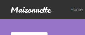
Main topbar elements
Is composed by a group of elements and most of them are going to be hidden ("mai-top-nav", "mai-icons-nav") on small devices.
Desktop View
Small View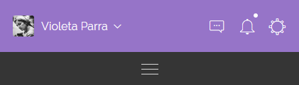
JavaScript #
In every page, we are calling an object method which handles the basic template interaction. It's written with "The Module Pattern" which encapsulates certain code, allowing to be used when it's needed.
We use a global javascript object called "App", it provides a modular structure that we use to initialize the demo Js plugins on each demo page. You can find several modules in "assets/js" inside the html folder.
Said that you'll notice that there are different Js modules for some of the demo pages, all of them are optional, exept the "app.js" or "app.min.js" in case you want to use the minified version.
init() Method #
This method is responsible for some of the bootstrap plugins initializing, both sidebars functionality and other responsive tasks. That's why this is the core method of this template.
You can add it at the end of the page like this:
<script type="text/javascript">
  $(document).ready(function(){
    App.init();
  });
</script>
Demo modules & methods #
In order to call the following methods you'll need to include the script reference of the JavaScript file, after that you can call it after the init method this way: App.methodName();
Each of these modules contain the JS init for the demo plugins, feel free to copy and modify according to your needs.
| File Name | Method | Page |
|---|---|---|
| app-dashboard.js | dashboard | index.html |
| app-ui-general.js | uiGeneral | ui-general.html |
| app-ui-notifications.js | uiNotifications | ui-notifications.html |
| app-ui-nestable-lists.js | uiNestableLists | ui-nestable-lists.html |
| app-charts.js | charts | charts.html |
| app-charts-chartjs.js | ChartJs | charts-chartjs.html |
| app-charts-morris.js | chartsMorris | charts-morris.html |
| app-charts-sparkline.js | chartsSparklines | charts-sparkline.html |
| app-form-elements.js | formElements | form-elements.html |
| app-form-wizard.js | wizard | form-wizard.html |
| app-form-masks.js | masks | form-masks.html |
| app-form-multiselect.js | formMultiselect | form-multiselect.html |
| app-mail-inbox.js | emailInbox | email-inbox.html |
| app-mail-compose.js | emailCompose | email-compose.html |
| app-tables-datatables.js | dataTables | tables-datatables.html |
| app-table-filters.js | tableFilters | tables-filters.html |
| app-pages-profile.js | pageProfile | pages-profile.html |
| app-pages-calendar.js | pageCalendar | pages-calendar.html |
| app-pages-gallery.js | pageGallery | pages-gallery.html |
| app-maps-google.js | mapsGoogle | maps-google.html |
| app-maps-vector.js | mapsVector | maps-vector.html |
Create an App module #
You can extend the App modular structure easily by creating your own modules like this:
var App = (function () {

  App.moduleName = function( ){
    'use strict'

    //Js Code

  };

  return App;
})(App || {});
Getting Started #
There are three different ways to use this template in your next project:
- Basic Setup
- Using SASS files
- Using NPM scripts
Basic Setup #
This is the quickest way to setup the template, you just have to copy the "starter" folder content into your project root folder and start working on the index.html file.
Be sure to include the essentials scripts in your document to get things work properly. After that you're ready to start building.
Cons
This method is perfect if you think you are not going to make several changes to the original version and use it "as is", otherwise we suggest to use one of the following methods.
NPM scripts #
The NPM scripts are a property of the package.json file, which allows us to define commands that will be executed several times in our workflow. We can create commands to execute tasks or operations like install, compile, minify, remove, distribute, etc., all without having to depend of a task runner.
If you haven't used NPM scrips before, be sure to check out the npm-scripts documentation.
Supposing that you already are familiar with NPM scrips, we are going to explain step by step how to get started with the built-in workflow.
Install Node #
If you already have Node.js installed you can skip this step.
- Be sure to have the latest version of Node.js installed & running in your computer. We are going to use npm that comes with Node.js installation.
Install npm dependencies #
In your root folder enter the following command to install the project dependencies: npm install, this command will install all the template libraries inside the source folder: src/assets/libs, you need to run this command before you run npm run dist command in order to include dependencies in distribution.
Setup SASS development environment #
In case you don't know nothing about css pre-processors, this is a brief description about what it is:
Sass is the most mature, stable, and powerful professional grade CSS extension language in the world.
In other words with css-preprocessors you can change the full color theme of this template by just changing a few lines of code.
Setting up your css file #
- In the sass folder
src/sass/you'll find a file calledapp.scss. - Rename it to a different name, for example
app.scss=>maisonnette.scss. - Then create a new file called
app.scsswhich you are going to use it to modify variables and create your custom code. -
After that, you'll need to include the original main SASS file into the new file like this:
app.scss// Your custom code goes here // Import the template source code @import "maisonnette";
Inside this file you can modify the bootstrap and template variables values for example to change the color palette:
app.scss// Modify template colors $primary: #9674c8; $danger: #FD3D39; $warning: #FFCB2F; $success: #53D86A; // Import the template source code @import "maisonnette";
Variables #
The template comes with several veriables that you can use to customize and create your own version, alongside with the Bootstrap default variables.
To see what variables are available go to "src/sass/config/_maisonnette-variables.scss".
Available Commands #
After install dependencies now you can run the automated commands that here are the available:
Custom commands
| Command | Description |
|---|---|
| npm install | Install and copy all the template libraries into src/assets/lib using the dep-copy.json file. |
| npm start | It runs the watch command and an express development server in 'http://localhost:8080/index.html', this way you can modify your sass files and it automatically runs the sass compiler task designed for development. |
| npm run dist | Generate the end-compiled-ready-to-use distribution dist folder in your project root. |
Adding new dependencies #
You can add new dependencies easily using npm, just open your terminal in your root path and install the dependency as usual using npm install dependency-name, then you'll need to add a new entry on dep-copy.json file.
Adding a new entry on dep-copy.json file
We use a dep-copy.json file to filter which files do we really want to be copied to our development/production environment reducing the unnecessary load of unused files.
Open the dep-copy.json file and add a new entry like this:
"npm-package-name": {
  "files":{
    "npm-dependency-destination/css" : "npm-dependency-name/css/*",
    "npm-dependency-destination/js" : "bootstrap/js/*"
  }
}
This way the new dependency will be copied from node_modules/npm-dependency-name/ to src/assets/lib/npm-dependency-destination/ and only the files you specified in the new npmcopy entry will be moved to the lib folder.
Globs is enabled for using on dep-copy.json file.
Plugins #
This template comes with four main dependencies, and several plugins for the demo pages, here is the plugin list with the official documentation for each one.
Support #
We are here to assist you, thank you for report any bug/issue to our email support@foxythemes.net.
What support includes?
- Availability to answer questions
- Answering technical questions about item's features
- Assistance with reported bugs and issues
- Help with included 3rd party assets
What support doesn't include:
- Customization services
- Installation services
If you already read the documentation and you still need assistance, please send us your purchase data to support@foxythemes.net and we'll be glad to help you.
Changelog #
| Change |
|---|
| Updated: Bootstrap to v4.3.1 |
| Added: Support for Sweetalerts2 |
| Improvement: Added shareable links on documentation page |
| Improvement: Moved variables initialization to App.init() function |
| Improvement: Switched from cards to alerts on documentation page notes |
| Improvement: Change default primary color back to green |
| Improvement: Change deprecated SASS color functions |
| Improvement: Improvents in the readme file |
| Improvement: Add empty state for main sub menu |
| Improvement: Add support for outline buttons |
| Improvement: Add Bootstrap input file examples |
| Fixed: Verify all pages are W3C compliant |
| Fixed: Perfect Scrollbar errors on top header |
| Fixed: App.js is not working on head tag |
| Fixed: Mobile menu strange delay effect when opening |
| Fixed: Depencies issues with breakpoint check and Bootstrap |
| Change |
|---|
| Fixed: Perfect scrollbar instantiation error on several pages |
| Change |
|---|
| Fixed: Perfect scrollbar instantiation error on several pages |
| Updated: Bootstrap to v4.1.3 |
| Updated: Perfect Scrollbar to v1.4.0 |
| Updated: Changed default primary color |
| Added: DataTable filters working example |
| Added: Readme to zip file |
| Improvement: Changed panel classes to cards |
| Improvement: Dropped grunt in favor of npm scripts |
| Improvement: Move docs inside the template |
| Improvement: Move git repos to npm packages |
| Fixed: User dropdown menu on phone resolutions |
| Fixed: Used margin instead of spaces in user dropdown menu items |
| Fixed: Syntax error on _invoice.scss |
| Change |
|---|
| Fixed: Boxed multiselect are wrong on small devices |
| Fixed: Error on Chart.js page |
| Change |
|---|
| Fixed: Logo is blurry on retina screens |
| Improvement: Added links who match a page |
| Improvement: Renamed dist folder 'light' by 'starter' |
| Improvement: Added chart tooltips |
| Updated: Bootstrap to v4.0.0 |
| Change |
|---|
| Fixed: Main navigation is not working properly |
| Fixed: Close icon size in S7 iconset |
| Fixed: Dropdowns display at top after BS4 update |
| Fixed: White corners in modals |
| Fixed: Center thick icon in custom checkbox |
| Fixed: Wrong border color in calendar popup |
| Fixed: Main nav z-index conflict with calendar |
| Fixed: Mega menu not working on small resolutions |
| Fixed: Bootstrap datepicker plugin is not working properly |
| Fixed: Dashboard widgets are broken on medium and small resolutions |
| Fixed: User nav is broken on extra small resolutions |
| Fixed: Dropdowns panel is wrong on medium and small resolutions |
| Fixed: Color contrasts panel is broken on large and medium resolutions |
| Fixed: Pagination panel is broken on medium and small resolutions |
| Fixed: Labels and inputs display is wrong on medium and small resolutions |
| Fixed: Forms elements display wrong on small resolutions |
| Fixed: Wizard plugin have a horizontal scroll |
| Fixed: Table filters display broken in medium resolutions and below |
| Fixed: Profile stats are wrong on medium and small resolutions |
| Fixed: Project Deadline is wrong on medium resolutions |
| Fixed: Login page is wrong on medium and small resolutions |
| Fixed: Sign up page is wrong on medium and small devices |
| Fixed: Forgot password page is wrong on medium and small devices |
| Fixed: Gallery items overlay are broken on medium resolutions and below |
| Fixed: Project list display wrong on medium resolutions |
| Fixed: Dashboard legend indicators in small resolutions |
| Fixed: Alerts don't have the same margin left |
| Fixed: Modal custom width not working |
| Improvement: Update fullcalendar to v3.8.0 |
| Improvement: Use month abbreviation in general tables |
| Change |
|---|
| Fixed: Datatables container-fluid class issue |
| Fixed: Placeholder not working on white backgrounds |
| Fixed: Link to 'Text Editor' feature not working |
| Fixed: Remove 'X-Editable' plugin |
| Improvement: Migrate dependencies from bower to npm |
| Improvement: Update Bootstrap to v4.0.0-beta.2 |
| Change |
|---|
| Added: Layout option to show logo on mobile |
| Added: Timeline pages |
| Added: Datepicker plugin |
| Added: Table filters page |
| Improvement: Primary color contrast calculation in main tabs |
| Improvement: Create style for dropzone file items |
| Fixed: Dashboard widget legend broken |
| Fixed: Text is cutting off with form select sm |
| Fixed: Radio button icon misaligned |
| Fixed: Page head component broken on mobile |
| Fixed: Logo text placeholder |
| Fixed: Wrong maxYear value in x-editable |
| Change |
|---|
| Fixed: Responsive menu in firefox |
| Change |
|---|
| Initial Release |